P. Kerim Friedman is an associate professor in the Department of Ethnic Relations and Cultures at National Dong Hwa University, in Taiwan, where he teaches linguistic and visual anthropology. He is co-director of the film Please Don’t Beat Me, Sir!, winner of the 2011 Jean Rouch Award from the Society of Visual Anthropology. Follow Kerim on Twitter.
View all posts by Kerim →


FORREAL THOUGH
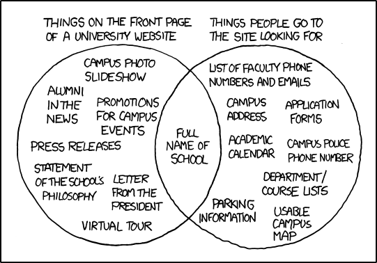
When I started attend my current PhD. granting institution, their website was great. It had direct links to all the information in the “things people go to the website looking for” circle in direct links on the front page. Then, without warning, they completely redesigned the website and removed most of the direct links. With the exception of the link to the library website, you now usually have to go through about three layers of links to find what you want or attempt to use the crappy search engine which doesn’t necessarily put a link to what you want on the first page. It seems like the only reason they changed the web page was so the university didn’t look different from other universities.
University web designers desperately need anthropologists to use ethnographic data to show what people actually want from the website. Of course, web designers don’t seem to know that they actually need this data.
My first thought was to recommend Steve Krug, Don’t Make Me Think! A Common Sense Approach to Web Usability, which is one of the best books on Web design I have ever read. Then it occurred to me that what counts as usable depends on objectives.
As I look at the diagram, the circle on the left reflects the objectives of a sales tool, directed primarily at prospective students and their parents. They are likely to be scanning a series of similar sites, trying to get a feel for different schools, and don’t want or need the kinds of information found in the circle on the right. The items in that circle are those most useful to people who already have a connection with the school and need specific information.
Then, however, the question arises who should have access to that information. I have noticed that on some school sites it is, for example, very difficult to find faculty email addresses. I imagine someone, could be either an administrator or a faculty member, worried about spam or recipients’ being overwhelmed by well-intentioned queries. Too much mail is a common complaint these days and paranoia not always ill-advised.
Like the businesses they increasingly come to resemble, academic institutions may have good reasons for restricting the public website to manageable PR and restricting access to internal information to those introduced via more private mechanisms, e.g., name cards exchanged at meetings or conferences.
Not saying that this is the best of all possible worlds. Just trying to do a bit of anthropological analysis on what seems to be a notable cultural phenomenon.
Interesting Venn diagram! I have perused a few University Websites and the continuum of quality is astounding. Contrast University of New Haven vs. University of Bridgeport vs. Fordham University vs. Columbia University.
Check out a comparison of anthro. depts. How many don’t open with a picture of small, brown people in a forest or desert with few clothes.
Maybe people who frequently use a university website for information and reference purposes are mostly people who work at the institution. It’s likely that they have already bookmarked the links to things like directories, library resources, and so on. First time visitors, however, might be folks outside the university: especially prospective students and other people with money (and, secondarily, skills or talent) that the university wants. In that situation, the website is primarily a branding and marketing tool, and so it’s all about flash, narrative, slogans, and such.
Apparently this cartoon is generating a lot of buzz from web site designers for universities. I’ve included a link to article below that includes more info:
http://www.insidehighered.com/news/2010/08/04/websites
Funny, how a small little cultural artifact such as this can generate the possibility of change. This just goes to show how the web has affected the the various social mechanisms through which culture changes.